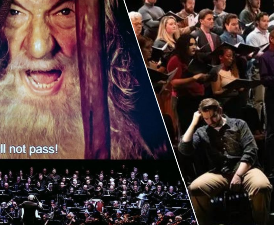
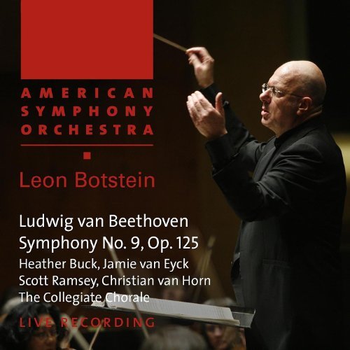
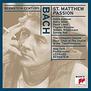
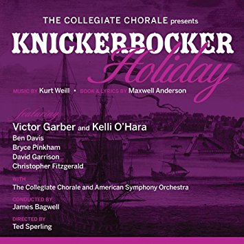
Here’s the backstory on our new logo! MasterVoices was founded in 1941 as The Collegiate Chorale, and the Chorale’s name – along with that of its founder, Robert Shaw – soon became world-renowned. Even now, many folks recognize the name from our plentiful performances on radio, record albums, and TV.

But by the time 2013 rolled around, we were getting too many repeat questions like “what’s a corral?” and “what college are you guys from?” (Bonus points if you knew that “collegiate” means friendly… or that we started out rehearsing at Marble Collegiate Church. Read more on that very cool history here.) We were in the 21st century after all, and it was time for a change.
So in 2015 we made it official: we were now MasterVoices. The new name required a new logo, and an announcement – thank you to the brilliant Roger Rees, for taking care of that part! Once we settled into the name, we began to feel the design didn’t quite suit us. Flash forward to the summer of 2021: our fantastic advertising company, SpotCo (the creative minds behind the Hamilton, Lincoln Center Theater, and basically anything cool on Broadway), took on the challenge. “We were inspired by MasterVoices’ musical variety, unique performances, and scope of work each season,” they said. “We wanted the branding to be instantly own-able and distinctive. Most importantly, we wanted to capture the group’s spirit, energy and musicality in an artful way.” Said Executive Director Jennifer Collins, “The idea was to create a look that better reflects our mission and the organization we strive to be – bold, contemporary, but also reflective of our historic roots. We also wanted to make a mark – literally!”
The rest, as they say, is history. For the graphic designers among you, the fonts used are Brandon Grotesque Regular and Brandon Grotesque Bold.